A blog documenting the creative process of a horror/ murder/ mystery point 'n' click visual novel game.
Saturday, 17 September 2011
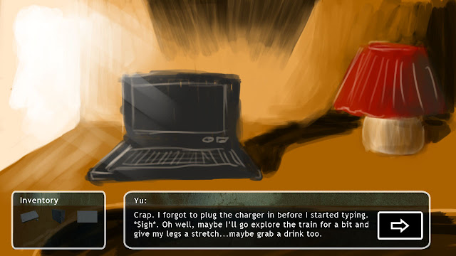
Interface design update
So the top screen will be what you constantly see when you play the game and the 2nd one is what you'll see when there is dialogue. What does everyone think? Is there too much text to read? Max is three lines I think so I'll edit the script to make sure that any existing dialogue does not exceed it.
Keep up the work yo'!
EDIT:
Borderless as Mike suggested.
Tweaked it again:
Subscribe to:
Post Comments (Atom)


Cool looking good. Yeh I think without the border looks slightly better, gives the images more room to breath (yeh I'm just repeating what I wrote on steam). Once someones playing the game the boundaries of their screen or the SWF boundry will act as a kind of border anyway so having one in game seems too much. Liking the look of it so far. I'll start implementing this soon.
ReplyDeletei think the borderless approach is best as well... but im liking it, its very aesthetically pleasing :D
ReplyDeleteAwesome, borderless it is! thanks guys!
ReplyDelete