Showing posts with label Item/Inventory design. Show all posts

Sunday, 16 October 2011

lol scenes.


Day1: Bar (Michelle, I just used your bg layers from your previous work and mirrored it to fill windows, hope you don't mind).


Day2: Bar before defib puzzle (lol poor Kenny, it looks like he's planking XDDD)


Day2: Bar after defib puzzle

Urgh okay another 3 done! I would work on these longer but time is of an essence.

I'll just update what I've done so far:
OPTIONS:
- Done the buttons and rollover states for the bartender
- Done the buttons and rollover states for Kenny and Magazine options

Note, Kenny and Magazine options are a simple Y/N so they can use the same assets.


Which just reminds me, we need a mag cover! Will do so now ....

(30 mins later)...


Cool, we now have a mag cover XD.  Mike, would you be able to make it 3D like you did with the ticket when you implement this?

Wow I'm all Photoshop out but I still need to do the ending cutscene.  Will get onto it later today and then all the major stuff should be done and then the epic tweaking shall commence!

Right, I'm contemplating whether I should go out and get breakfast or just go to bed....hmmm!

Monday, 10 October 2011

Sunday, 9 October 2011

Volume control, hand and eye icons

I thought that it would make sense to have the volume control on Yu's actual phone, although I think this was probably already suggested before.

Basically, on selecting the phone in the inventory there would be a volume button below the map button, which would make the phone show this :

On selecting mute, the volume of the game is muted, and selecting the blue bars raises or lowers the volume, or maybe it just needs to be hovered over.

Here are the pressed and unpressed buttons, and used and unused volume bars:

Also the eye and hand icons:


Thursday, 6 October 2011

Front View of Defib

As requested, here is the front view of the defib!


I am also working on Kemi's phone and it is being based off the video camera phone from FFVII: Advent Children.

Tuesday, 4 October 2011

Painted Defib (sort of)

I have attempted to paint over the defib model...however it will probably need some more work LOL.

Tuesday, 27 September 2011

Michelle's bg + Interface test


I also found this on dA:


Whooooop! *Goes back to making guard sprite*

Yu's items for Day1


 Phone closed...


 Phone opened after examination...

Yu's fancy wallet, "Maul Smith" designer brand.

And his ticket with amended spelling.

I'll stop here for today in item colouring and go back to sprites XD.  TO THE TRAIN GUARD...after snoozies....

Sunday, 25 September 2011

Yu's house blue print update + Yu's train ticket lol

 Just to make the wall divider a bit clearer (see 3rd pic), front door label added to make it clear where the front door is (thanks Errol) XD.
 I probs should've added the red squares like downstairs but I believe the pic below will explain all...
 View point from front door into the left side of the archway towards the living room and the wall divider.
View to the other side of the archway, if Rumzi could change the chest of drawers thingy to waist height that'll be awesome.  If we can get this done, Michelle and maybe a few others can start painting over these for the time being?  ML needs some more time to sort out the train environments so until then, Rumzi will be helping out with the train stuff.  If anyone has free time, I suggest painting over the item designs that Rumzi has kindly done just so that we can get some assets finished!! Cheers!

Oh yeh, Yu's train ticket XD :


Some drawings and update

I am alive! Been sleepy most of this week, but should be online a lot more this coming week and have a lot more to show. Anyway I'll show some stuff I've done.


Here are some quick designs for the uniform for the bartender. It's actually pretty hard to come up with different designs for a bartender as it seems there's only so much you can do. But anyway I got several designs done here. The most left design is most similar to what I originally had him wearing in my drawings. The next one he's only wearing a shirt and bow tie. I also added some straps around his upper arm. I've seen some people wearing these, I'm not actually sure what the point of them is but I think its to pull up the sleeves or something like that, would make sense for a bartender. The very right I gave him a skinny tie as I was running out of ideas. In all of them he's wearing high rise trousers (I'm pretty sure that's not there name) but I figured seeing as we wont really see the trousers it dosnt matter too much.


The train card. I decided to design the logo like a parody of the national rail. I took their design and distorted it in a number of ways. Not really a 'ha ha' parody, just a visual one. The card from what I remember is also the key to Yu's room so I built a black strip into it for it to be used for that while also displaying all the travel information such as time date and route. The very bottom card I removed the strip with the idea being the strip would be on the back anyway.


The old man pose. Was thinking of what kind of stance the old man should have. I figured having him in a kind of huddled position might be nice. As I think we never talk to him when he's not sitting at the table I thought it would be ok to depict him sitting at a table in his pose. I also did a quick sketch of a possible redesign. I dunno, I felt like giving some facial hair.


Jade mentioned she had already finished him. So this is just a final drawing I did of the train guard a few days ago.

Tuesday, 20 September 2011

Interface design update

I've just about finalised how the menu system would look like now *happy dance*.  Gosh I'm so awake and it's already 3am!  Anyway here be the uploads.


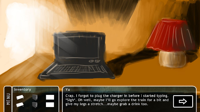
So here's the main interface with a newly added menu button to the side.  Maybe the dialogue box should be attached to the others like how the menu overlays with the inventory box?  Thoughts anyone?


How it looks like w/o the dialogue.


When you pick an item up.


Obviously, the default.  Help = how to play (might do that later). Exit = exit game, Return = exit menu/go back to game.


When you click on one of the items, a CU appears.


CU for the phone, an 'EXAMINE' button appears so you can find more stuff about items.


For the phone, you click EXAMINE and you can play with the phone.  I know I'm lazy about the BG of the phone and I am lazy with getting the other phone buttons to work.  Just say 'no service' or 'update' lol.


I was thinking the audio options can be located under media/music lol.  But let's do that later.

BTW, how would the combine system work? Drag/drop the smaller inventory to the larger one?  We can work it out sooner or later.

Monday, 19 September 2011

Inventory ideas and angry man designs (and not in that order)

So the title really says it all so lets get to it. (Jades watching us) So up first is the angry man on the train design. Kind of realised he hadn't been designed yet so I set about it yesterday. I did a couple of designs (didn't really go into clothes as I figured he would be wearing shirt/tie in any designs) so I focused on the face. There's one I think is the strongest design and believe works best, but I did a few more just to mess around a bit and make sure I'd got the right idea. I'll let everyone else see which one they like the most (the one in the upper left makes me laugth).
 
So I've also done some designs for the inventory system. I know Jade has had some trouble designing it and quite frankly I had trouble designing it too and one idea I hit upon is; do we really need a separate screen for the items. There's several reasons I thought this. For one the separate screen for the items adds nothing other then allowing us to see a close up of the item itself (hold on I'll come back to that) . We could of used it for combining items and we can, but it seems just as easy to do that in the main game screen (you'll select the item, press the combine button and then click the item you wish to combine with). Due to a quirk of the engine (and by quirk I mean really annoying glitch that means you can't select an item and then switch state - side note - a way around that just occurred to me this second but lets leave that for now) all the items have to be displayed on the main screen, which I think is quite helpful and makes selecting items easier anyway. There's little need for a screen purely for the inventory as it doesn't seem to do much. So what I propose is that we scrap that screen altogether and have it so that when you use the look function on an item in the inventory, it will display the dialog explaining what that item is and show a close up of that item on top of the screen. Like so;


BUT! Because I know this idea may not be popular or I've missed something that someone will bring up in the comments, I did a quick whip up of the layout for the inventory screen anyway. Though it does result in a lot of empty space which is a bit of a shame, but honestly I'm really struggling with it. This design I believe would be the most efficient and practical, all the items down one side and the description and image on the right when clicked on. Not all that different from the TKON one. For things like the phone there would be an option to use and by pressing on use it would then take you to another screen altogether (which is actually how it would work in the other design too).
(Prize to who ever spots the item that dosen't belong)
I didn't go all out on the graphics as I wanted to focus on the layout and get that down before worrying about the overall look of it.

Just in case anyone asks. I know in a lot of other games the items are displayed in like a drop down box and believe me I tried to get something like that working, its not the fault of as3 or flixel but mine that I just can't get it to work properly. It basically would end up crashing the file as it wouldn't frikkin disappear after you clicked and after much trial and error I just figured to leave it. But that's actually another reason I like the idea I've proposed, if you think to monkey island 4's inventory, that just appears over the current screen as do ermm probably a lot of other games that I cant think of right now!

Anyway enjoy. And if people really don't like this idea or the layout for the inventory screen I'm sure we can figure out some new design that works even better and I'll have a bit more a think about it.

Sunday, 18 September 2011

Defib!

Here is the defib. This was the second attempt at one as the first one came out....weird. It looked melted for some reason..lol

I kept the paddles flat because on the images for the portable defibs they had flat sticky paddles. I guess because they are more portable. I can do the proper ones if you want though.

Saturday, 17 September 2011

Interface design update


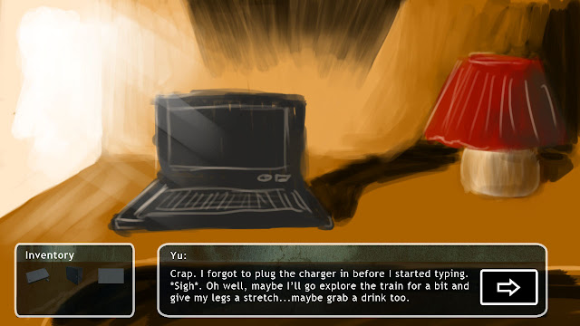
So the top screen will be what you constantly see when you play the game and the 2nd one is what  you'll see when there is dialogue.  What does everyone think?  Is there too much text to read? Max is three lines I think so I'll edit the script to make sure that any existing dialogue does not exceed it.

Keep up the work yo'!

EDIT:


Borderless as Mike suggested.

Tweaked it again:


Sunday, 11 September 2011

Yu's phone +


Added a camera and a caller I.D to the back of the phone. Let me know if there is anything you want changed or added.


Towel with ice.....or a rare species of squid...

So I spent a while trying to simulate the cloth to make it move around the ice and eventually I got to this...

It is basically the towel tied around the ice to make it like a make-shift ice pack.


Or it's a squid...


Friday, 9 September 2011

Towel WIP

I have redone the towel but I am having problems with getting the actual fabric texture right. On the sides it comes out as too strong and on the top its barely noticeable. I will try to edit it in Photoshop to see if I can change the levels.