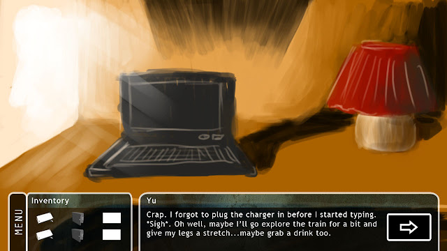
So here's the main interface with a newly added menu button to the side. Maybe the dialogue box should be attached to the others like how the menu overlays with the inventory box? Thoughts anyone?
Obviously, the default. Help = how to play (might do that later). Exit = exit game, Return = exit menu/go back to game.
When you click on one of the items, a CU appears.
CU for the phone, an 'EXAMINE' button appears so you can find more stuff about items.
For the phone, you click EXAMINE and you can play with the phone. I know I'm lazy about the BG of the phone and I am lazy with getting the other phone buttons to work. Just say 'no service' or 'update' lol.
How it looks like w/o the dialogue.
Obviously, the default. Help = how to play (might do that later). Exit = exit game, Return = exit menu/go back to game.
When you click on one of the items, a CU appears.
CU for the phone, an 'EXAMINE' button appears so you can find more stuff about items.
For the phone, you click EXAMINE and you can play with the phone. I know I'm lazy about the BG of the phone and I am lazy with getting the other phone buttons to work. Just say 'no service' or 'update' lol.
I was thinking the audio options can be located under media/music lol. But let's do that later.
BTW, how would the combine system work? Drag/drop the smaller inventory to the larger one? We can work it out sooner or later.


WOOOOAHHH DUDE THIS IS MORE LIKE IT WOW....
ReplyDeletethis is proper like phoenix wright..but more detailed :D:D:D i LOVE IT!! so so so so cool..
combine system.. hmm... i really liked how it was in your last flash game, that was quite simple and easy to understand :D
AWESOME =D it reminds me of something hmmmmmmmmmmmm
ReplyDeleteI shall tweak it when Mike gets back lol I think he's gone slightly AWOL XD
ReplyDeleteWhat does it remind you of Errol?
Thanks guys! :D